
How to Design Custom Tissue Paper That Stands Out
Master the art of custom tissue paper design with practical tips on patterns, colors, layout, and print production. Make your brand unforgettable from the first layer.

Designing Tissue Paper That Customers Want to Photograph
You've decided to add custom tissue paper to your packaging — great choice. Now comes the fun part: designing it. A well-designed tissue paper pattern turns a functional packaging material into a brand statement. A poorly designed one looks like an afterthought.
The difference between good and great tissue paper design comes down to understanding a few key principles: how the paper behaves when crumpled, how colors interact with thin material, and how patterns read at different scales. In this guide, we'll walk through the design principles, pattern types, color strategies, and production considerations that separate forgettable tissue paper from the kind customers keep, photograph, and share on social media.
The Four Main Pattern Styles
1. Logo Repeat (Tiled Pattern)
Your logo reproduced in a regular grid pattern across the entire sheet. This is the most common approach and works well for most brands. The repeating nature ensures your logo is visible no matter how the tissue paper is folded, crumpled, or positioned.
- Best for: Corporate gifting, professional services, established brands with strong logo recognition
- Design tip: Space logos 3-4 inches apart. Too tight looks cluttered; too loose looks sparse. The sweet spot is spacing roughly equal to 1.5-2x the width of the logo itself.
- Rotation trick: Alternate every other row by rotating logos 45 degrees for visual interest. This prevents the pattern from looking like a boring grid while maintaining order.
- Variation: Try alternating your logo with a secondary brand element (a tagline, icon, or brand mark) for added depth.
2. Custom Pattern (Illustrated)
Original illustrations or icons arranged in a repeating pattern. Think floral patterns for a botanicals brand, coffee cups for a cafe, or geometric shapes in your brand colors. This is the most visually interesting approach and creates the most shareable unboxing content.
- Best for: Lifestyle brands, creative businesses, boutiques, food brands, any brand with a strong visual identity beyond just a logo
- Design tip: Create a seamless tile that repeats naturally — test it by laying multiple copies side by side digitally. Any seam between tiles should be invisible.
- Complexity note: More complex illustrations may require full-color printing, which increases cost. Consider simplifying to 2-3 colors for budget-friendly production while maintaining visual impact.
- Size matters: Pattern elements should be large enough to be recognizable when the paper is crumpled. Tiny details get lost.
3. Typography Pattern
Words, phrases, or your brand name arranged as a pattern. "Thank You" in various sizes, your tagline repeated, or product-related words (a tea company might use "steep," "sip," "savor," "relax").
- Best for: Brands with strong verbal identity, thank-you packaging, seasonal themes, brands whose name IS their identity
- Design tip: Mix font sizes and weights for visual depth. All one size looks monotonous. Combine large bold text with small light text for hierarchy.
- Language play: Use your brand's tone of voice in the words you choose. A playful brand might scatter puns and jokes. A luxury brand might use elegant single words.
4. Abstract/Color Block
Bold color blocks, gradients, brushstrokes, or abstract shapes in your brand colors. No logo, no text — just pure visual branding through color and form.
- Best for: Fashion brands, art-forward businesses, brands with distinctive color palettes that are recognizable without a logo
- Design tip: This works best when your brand colors are highly recognizable. Tiffany blue, Hermes orange — if your colors are that distinctive, abstract patterns are powerful. If your colors aren't instantly identifiable yet, consider adding a small logo element.
- Gradient warning: Gradients are harder to print on tissue paper than on thicker materials. Test with your printer before committing to a large run.
Color Strategy: Making the Right Choices
Number of Colors
| Color Count | Cost | Best Approach |
|---|---|---|
| 1 color | Most affordable | Logo in a single strong color on white or colored tissue. The classic approach that works for 80% of brands. |
| 2 colors | Moderate | Logo + accent color, or two-tone pattern. Adds depth without breaking the bank. |
| 3+ colors / Full color | Premium | Complex illustrations, photographic elements, gradients. Reserve for designs that truly need it. |
Tissue Paper Base Colors
The base color of your tissue paper is part of your design. Options typically include:
- White — Clean, versatile, works with any print color. The safe and smart choice for most brands.
- Kraft/Natural — Earthy, organic feel. Great for eco-conscious brands. Works beautifully with white, black, or dark green ink.
- Black — Dramatic, luxurious. Requires light ink colors (white, gold, silver). Creates high-end unboxing vibes.
- Colored (pink, navy, green, etc.) — Makes a bold statement but limits print color options. Best when color itself is your brand statement.
High-Contrast Is King
The number one design rule for tissue paper: contrast, contrast, contrast. Tissue paper is thin and translucent, which means subtle color differences disappear when the paper is crumpled or layered. Dark ink on light paper or light ink on dark paper ensures your design stays visible in any state. Test your design by viewing it at 50% opacity on screen — that simulates how it'll look when doubled over.
Layout and Spacing
The Grid
Most tissue paper patterns use one of these grid layouts:
- Straight grid — Logos/elements aligned in rows and columns. Clean and structured. Works well for corporate and professional brands.
- Diagonal grid — Elements rotated 45 degrees. More dynamic and interesting. The most popular layout for lifestyle brands.
- Brick pattern — Like a straight grid but with alternating rows offset by half a step. Natural and easy on the eyes. The most versatile option.
- Random scatter — Elements placed organically without a strict grid. Feels casual and playful. Hardest to execute well but most visually interesting when done right.
Element Sizing
For a standard 20" x 30" tissue paper sheet:
- Logo elements: 1.5-3 inches wide works for most designs. Bigger is better for crumpled visibility.
- Pattern elements (icons, illustrations): 0.5-2 inches, depending on density. Smaller elements need more of them to fill the space.
- Spacing: Equal to or slightly larger than the element size. A 2-inch logo should have 2-3 inches of space around it. White space is your friend — it's what makes the design feel premium rather than cluttered.
Designing for the Real World
Test the Crumple
Tissue paper doesn't stay flat. It gets crumpled, bunched, folded, and layered. A design that looks beautiful flat but disappears when crumpled has failed its purpose. Test your design by printing a sample and actually crumpling it up in a box. Does the pattern still read? Can you still identify the brand? If yes, you're good. If not, increase the scale or contrast.
Design for Instagram
Your tissue paper will be photographed — both by you for marketing content and by customers sharing their unboxing. Design with photography in mind:
- High contrast photographs better than subtle tones
- Patterns with visual depth look interesting in flat-lay photos
- Consider how the tissue paper looks when partially pulled open (the classic unboxing moment)
- Think about the background color of your shipping box — the tissue paper should pop against it
Consider the Product Context
What product will the tissue paper wrap? A bold, busy pattern might overwhelm a delicate piece of jewelry. A minimal design might get lost next to a colorful clothing item. Match the visual weight of your tissue paper to the visual weight of your product. The tissue paper should enhance the product's presentation, not compete with it.
Think About Layering
Tissue paper is often seen in layers — multiple sheets stacked or folded. Test how your design looks when two sheets overlap. Some patterns create beautiful moire effects when layered; others look chaotic. Transparent areas of your design will show through from underneath.
Production Specifications
File Requirements
- Format: Vector (AI, EPS, PDF) strongly preferred. Raster files at 300 DPI minimum.
- Color mode: Pantone (PMS) for spot colors. CMYK for full-color printing.
- Bleed: Design your pattern to tile seamlessly — bleed isn't an issue for repeating patterns since the tile continues infinitely.
- File dimensions: Provide the repeat tile at actual print size. Include a note specifying the tile dimensions and desired spacing.
Ink Types
- Standard offset ink — Most common, vibrant, durable. The default choice for most projects.
- Soy-based ink — Eco-friendly alternative, slightly softer colors. A good choice for brands emphasizing sustainability.
- Metallic ink — Gold, silver, copper, rose gold for premium look (higher cost, limited to spot color printing).
- UV ink — Fast-drying, bright colors, good for high-detail patterns and shorter print runs.
Pairing Your Tissue Design With Other Packaging
Your tissue paper design should complement, not compete with, your other branded packaging:
- If your poly mailers are bold and colorful, consider a more subtle tissue paper pattern inside. Contrast between outside and inside creates intrigue.
- If your shipping packaging is plain, let the tissue paper be your statement piece. All the more reason to go bold with the design.
- Your sticker seal should match or complement the tissue paper color palette. A matchy-matchy look is actually great here.
- Gift tags should use the same brand colors and fonts for visual cohesion across the entire unboxing experience.
Common Design Mistakes
- Too small, too tight — Logos and elements that are too small with too little spacing look busy and lose impact when crumpled.
- Low contrast — If you squint and can't see the pattern, it's too subtle for tissue paper.
- Raster art at low resolution — Blurry logos on tissue paper scream "amateur." Always use vectors.
- Ignoring the fold — Consider where your tissue paper will fold when placed in a box. Important elements shouldn't land exactly on fold lines where they'll be creased and hard to read.
- Over-designing — Tissue paper is a supporting player in the packaging experience. It should complement your product, not overshadow it.
- Not testing before ordering — Print your design on thin paper from a regular printer to simulate the tissue paper effect before committing to a production run.
Next Steps
Ready to design your custom tissue paper? Here's your action plan:
- Choose your pattern style (logo repeat, custom pattern, typography, or abstract)
- Select your base color and ink colors
- Create or commission your design using the guidelines above
- Request a free quote from Qstomize with your specifications
- Review your digital proof (we'll provide one before printing)
For practical tips on using tissue paper effectively once you have it, revisit our tissue paper ordering guide or see how it fits into a bigger strategy in the complete guide to custom packaging.
Ready to Order Custom Promotional Products?
Get professional mockups and bulk pricing within 24 hours
Get Your Free QuoteRelated Articles

Gym and Fitness Promotional Products That Get Used Daily
The best fitness promotional products are the ones that get used every day. From foam rollers to yoga mats, discover branded gym products that deliver ongoing brand exposure in fitness environments.
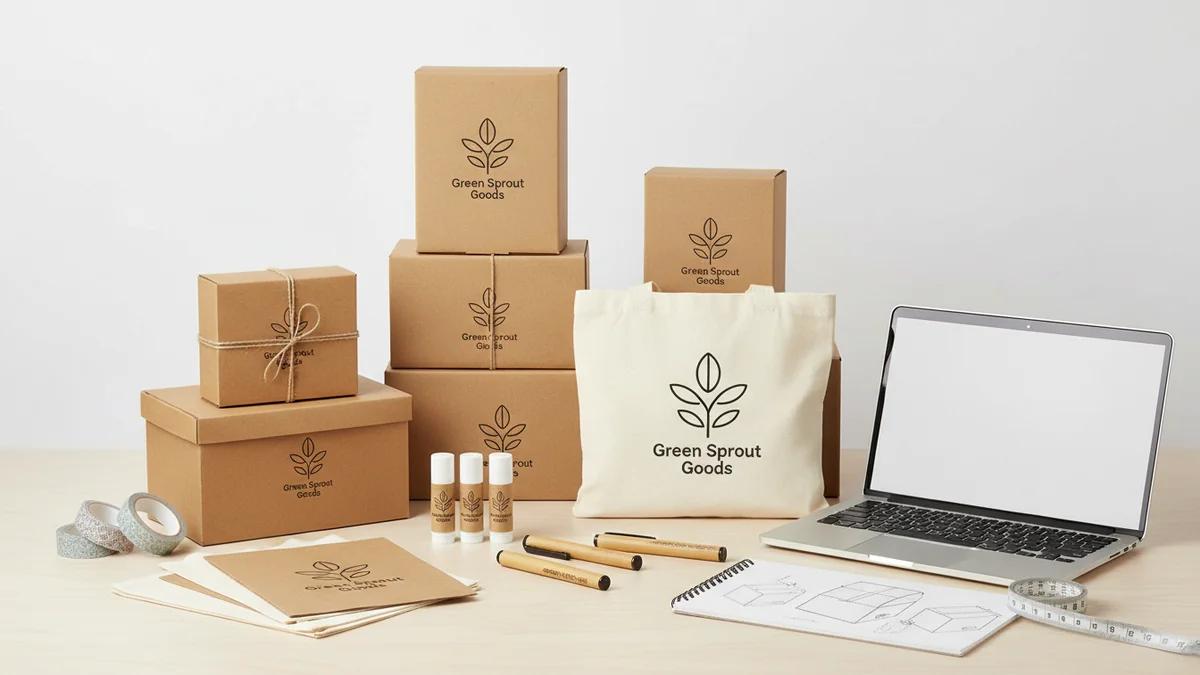
Custom Packaging for Small Business: Getting Started on a Budget
Custom packaging doesn't require a big budget. Learn how small businesses can create professional branded packaging for under $1 per order with smart, strategic choices.
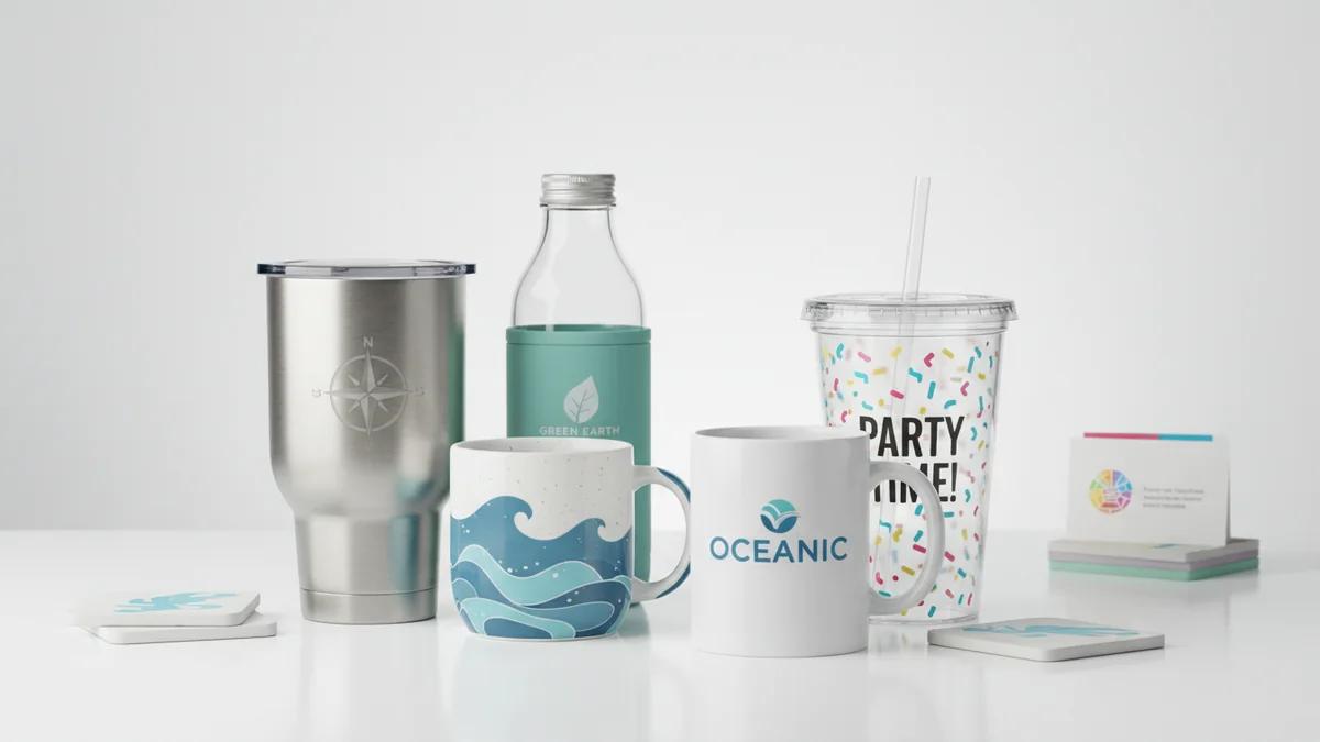
How to Choose the Right Custom Drinkware for Your Brand
With so many custom drinkware options available, choosing the right one for your brand can be overwhelming. This guide breaks down the decision by audience, budget, event type, and brand personality.